is a company reimagining the interface to knowledge through AI-driven solutions. This project aims to revamp the website and brand for clearer communication and stronger brand identity building—professional, incisive, and innovative.
 Before and after
Color
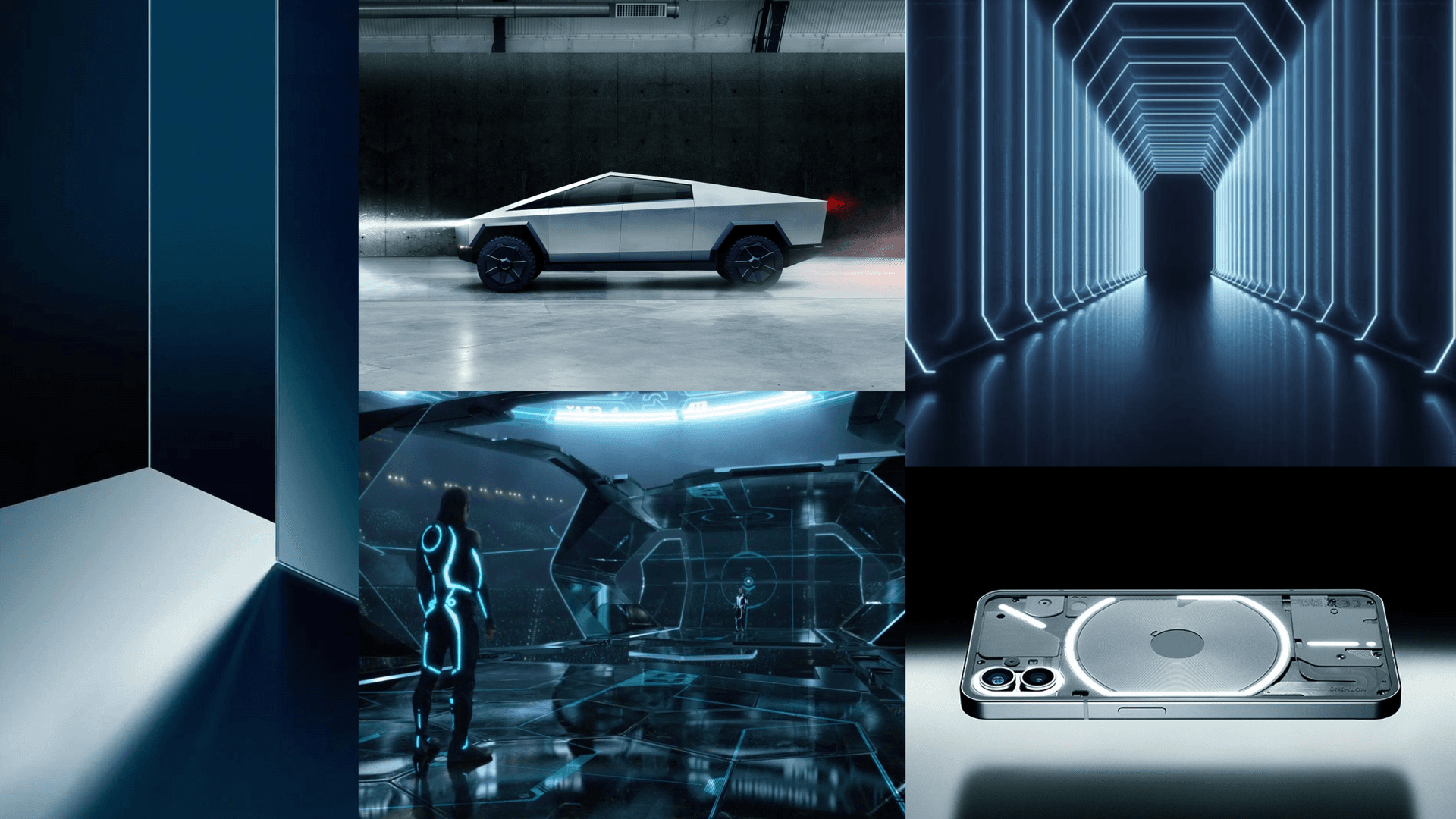
The redesign started from color. To break away from the conventional blue that traditional tech companies overuse, we shifted towards cyan, which maintains a calm ambiance while injecting a unique, subtly futuristic vibe.
 Color inspiration
Website
After organizing the company and product introduction by section, an idea emerged to abstract "the interface to knowledge" into a "portal"—serving as a visual element that deepens the audience's impression of our vision.
The further idea was to create a feeling of "traversing a mysterious portal where countless pieces of knowledge appear" through an animated intro. This animation would connect seamlessly with our logo and the following company introduction immersively.
The 3D portal was created in Spline, which allows making animations and interactions easily. Subtle particles and reflective lights are also added to make it more appealing and vibey. Finally, it was placed in the bottom right corner of the company introduction page.
For the product introduction page, the layout remains the same. The 3D element in the corner is replaced with a rotating 3D product logo.
Logo
The concept of the symbol is also based on the portal. An angled rectangle frame, some offsets, and some negative spaces—that's it. In fact, it's a simplified version of the 3D portal.
The wordmark uses uppercase letters for a more solid and balanced feel. Breaks at certain points not only create a unique look but also harmonize with the logomark's pattern.


The team is excited with the current results. While there's still room for further exploration and expansion, we've decided to move forward with what we have for now. As Hallidai grows, its digital image will continue to evolve. Let's see.


